echt jetzt Packaging
Type
Client
Sector
Tasks
Year
Credits
Agency: Studio ONOM
Design & Strategy: Maxi Mayer
Additional Content: Luisa Nerb
Info
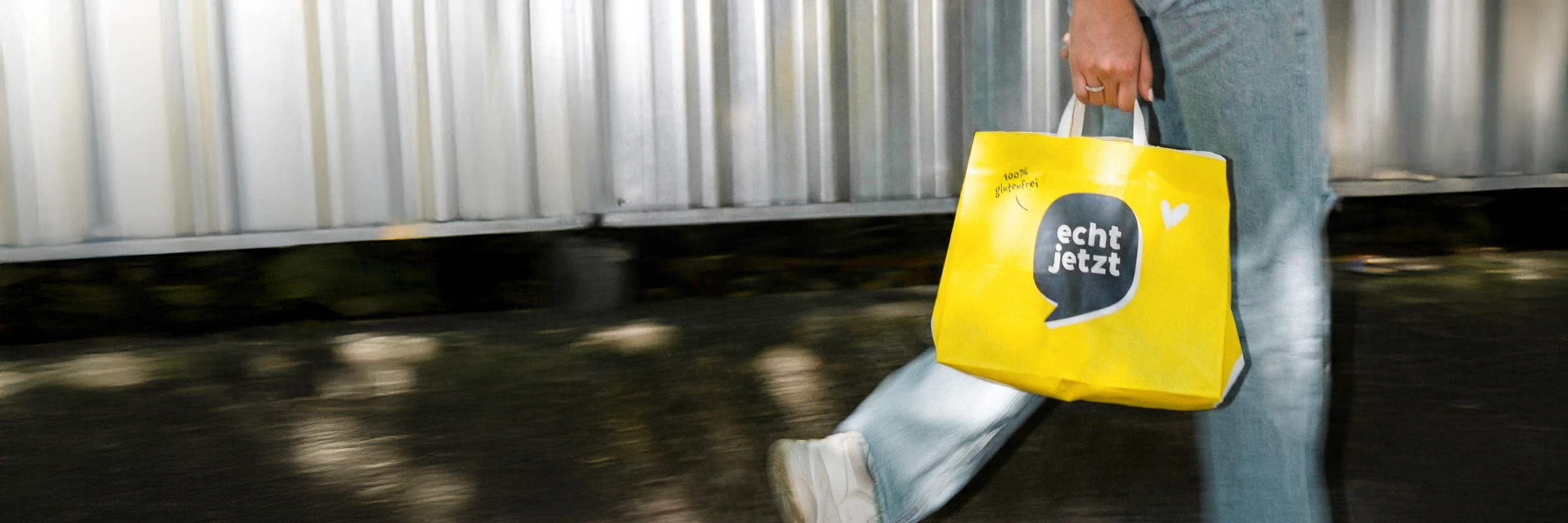
We have worked with echt jetzt for several years. The core logo stayed; almost everything around it changed.

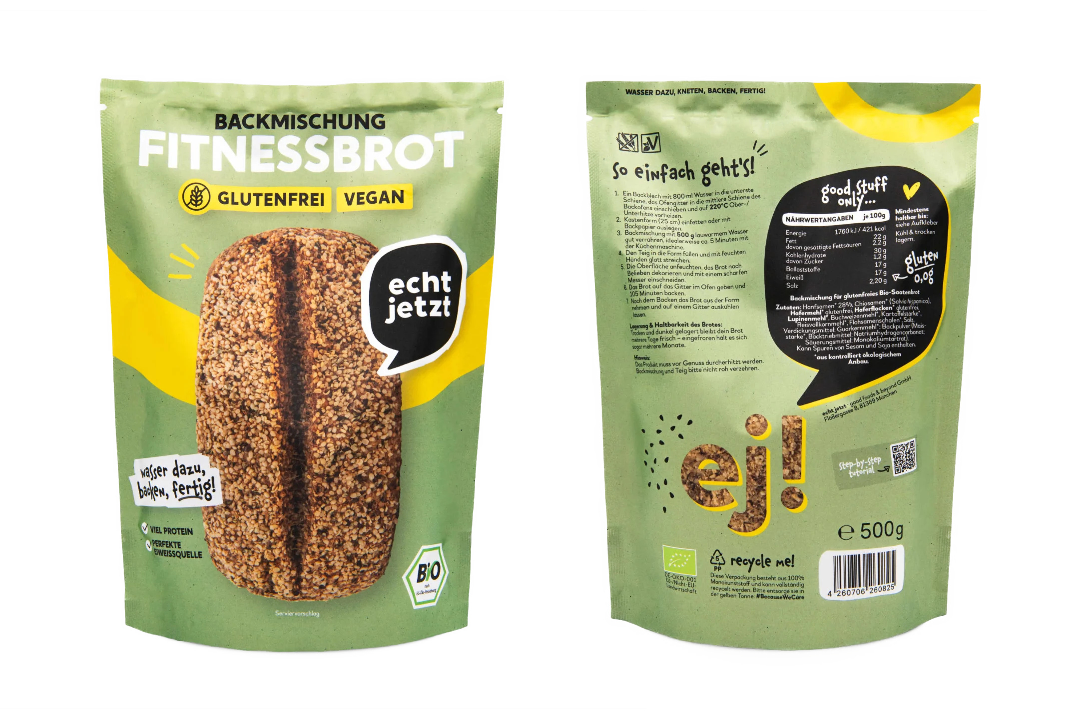

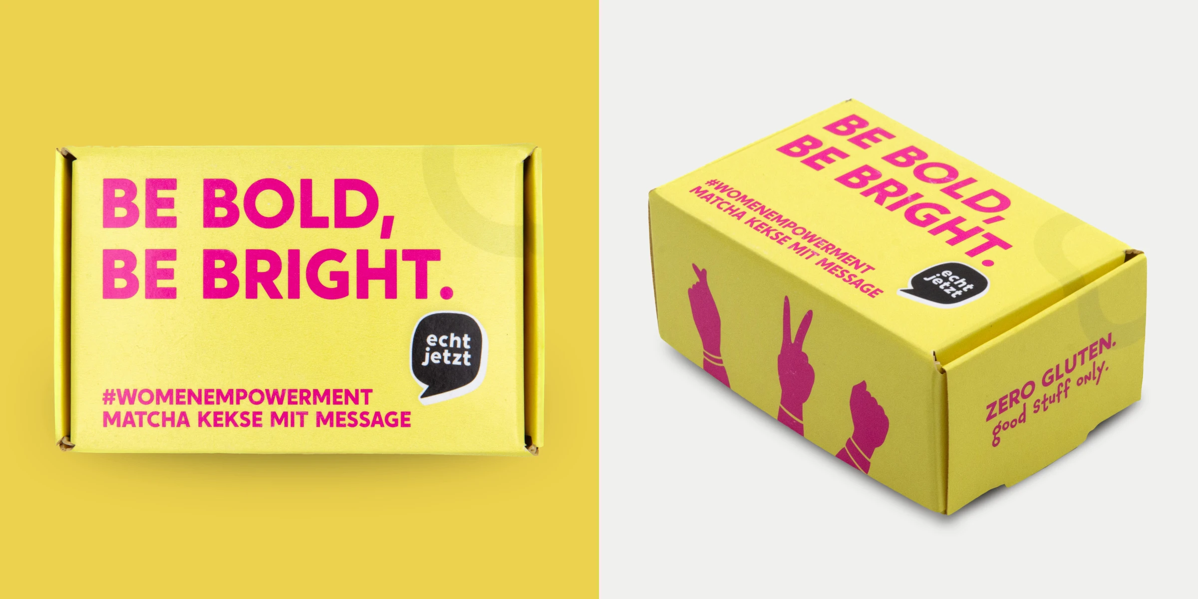
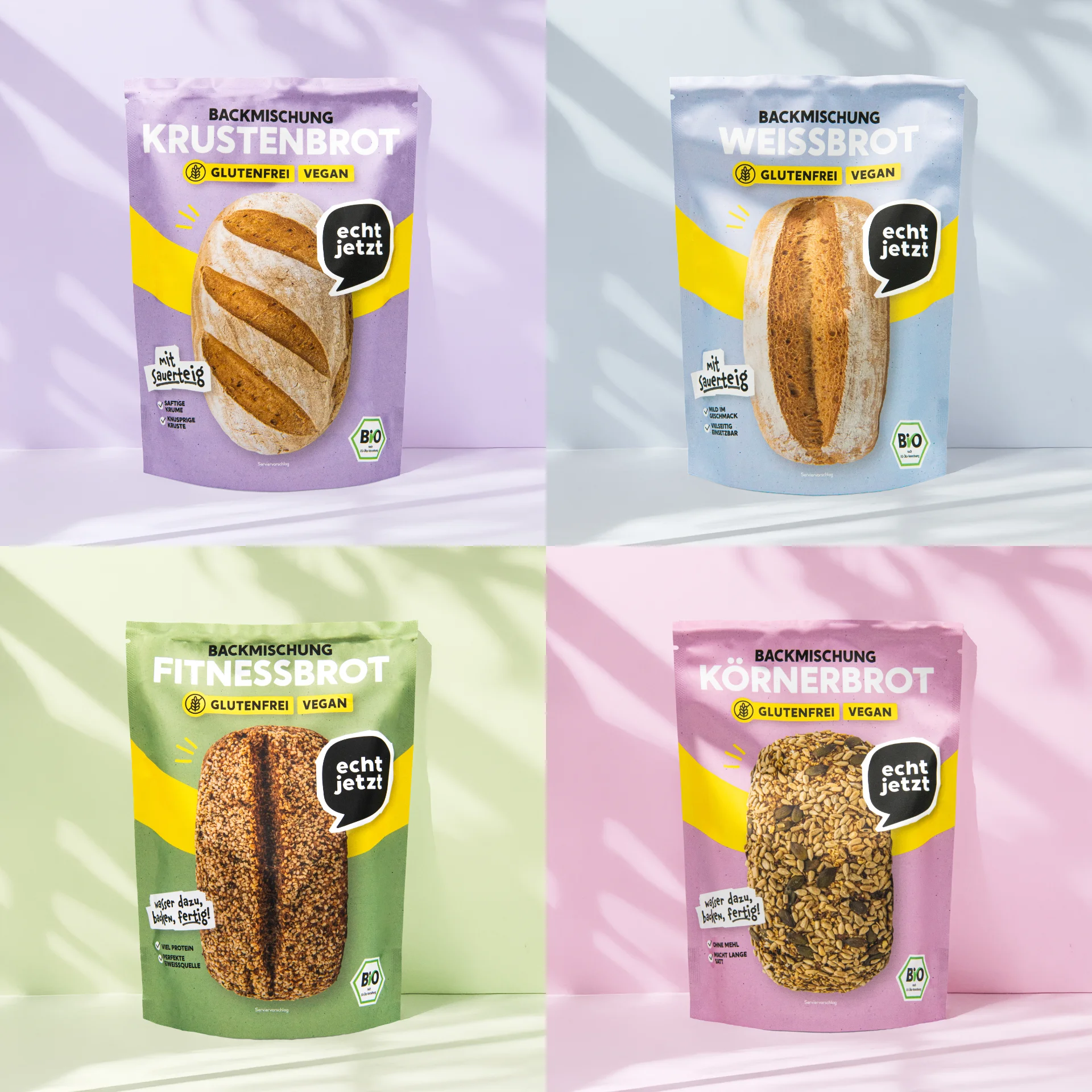
The packaging brief came down to a colour decision. The identity had been built on a single brand yellow, applied across the entire range. We moved away from that and gave each product its own colour, so that opening an echt jetzt parcel means opening a box full of them. Diversity is the point of the brand — the packaging had to look like it.
The second decision was tonal. Gluten-free products often tend to signal a medical diagnosis. We took the range in the opposite direction, because living with coeliac disease should not have to look or taste like a restriction.
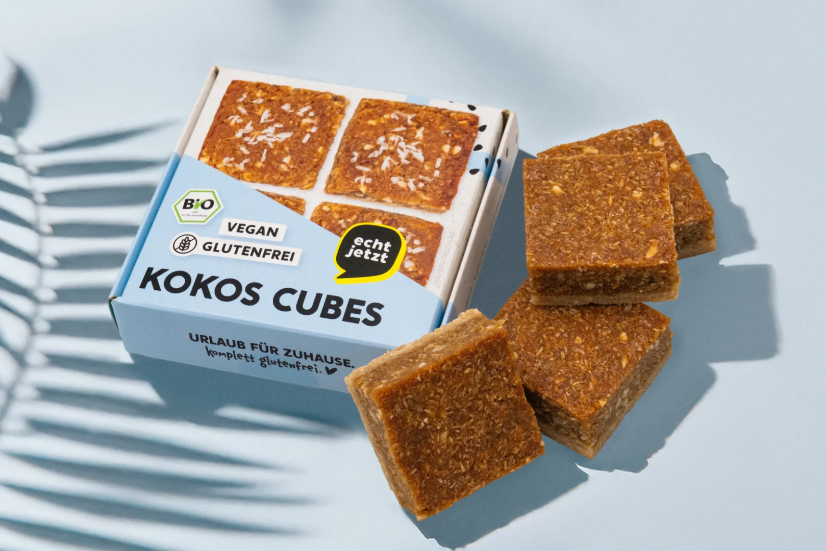
Formats, materials and finishes were specified product by product — folding cartons, flat pouches, doypacks — each matched to what it holds and to how the brand should read on a shelf.
Credits
Agency: Studio ONOM
Design & Strategy: Maxi Mayer
Additional Content: Luisa Nerb
Info
We have worked with echt jetzt for several years. The core logo stayed; almost everything around it changed.
The packaging brief came down to a colour decision. The identity had been built on a single brand yellow, applied across the entire range. We moved away from that and gave each product its own colour, so that opening an echt jetzt parcel means opening a box full of them. Diversity is the point of the brand — the packaging had to look like it.
The second decision was tonal. Gluten-free products often tend to signal a medical diagnosis. We took the range in the opposite direction, because living with coeliac disease should not have to look or taste like a restriction.
Formats, materials and finishes were specified product by product — folding cartons, flat pouches, doypacks — each matched to what it holds and to how the brand should read on a shelf.