BERLIN Condensed
Type
Client
Sector
Tasks
Year
Credits
Info
Berlin Condensed is an in-house typeface study, still in development.
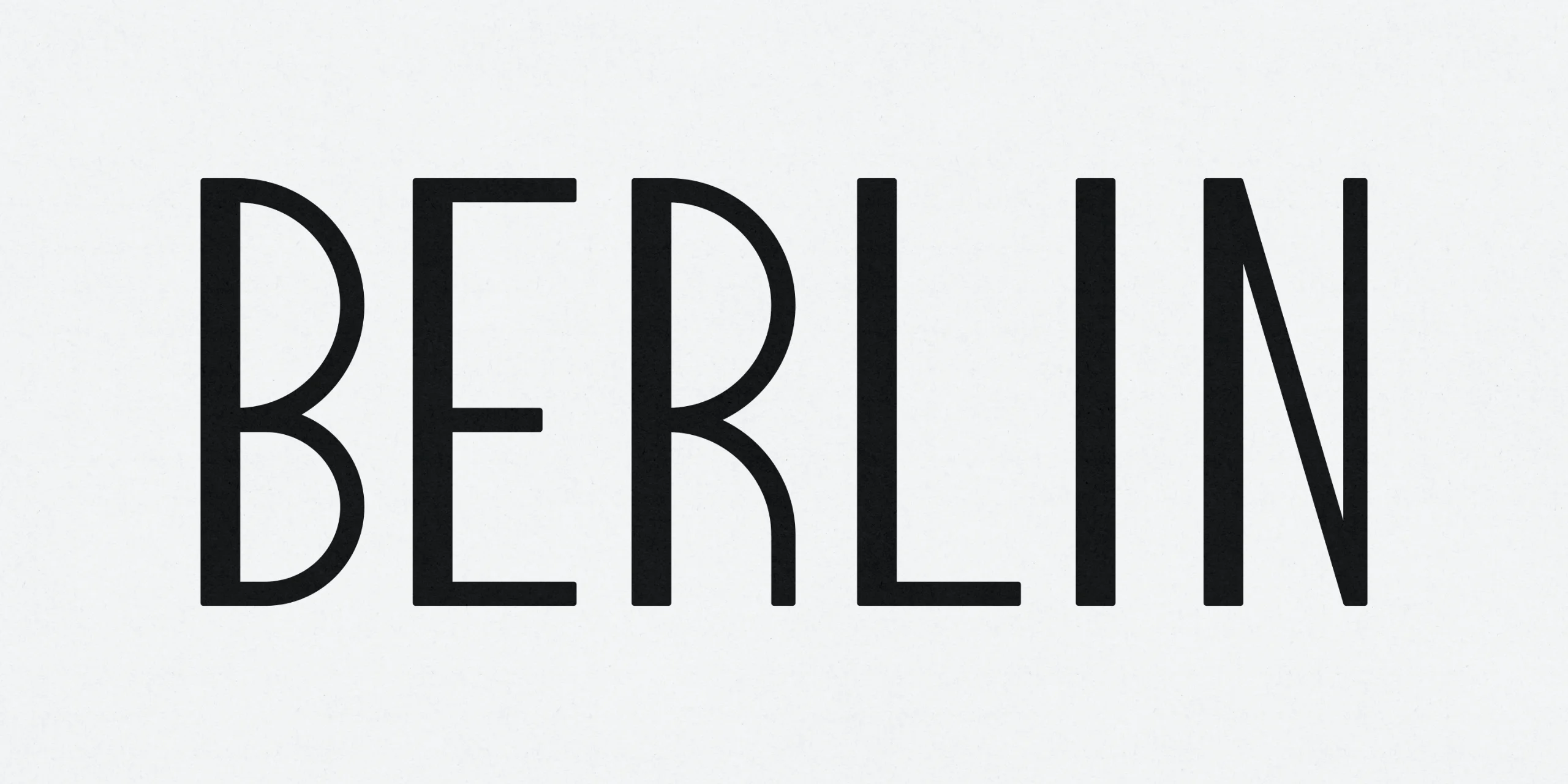
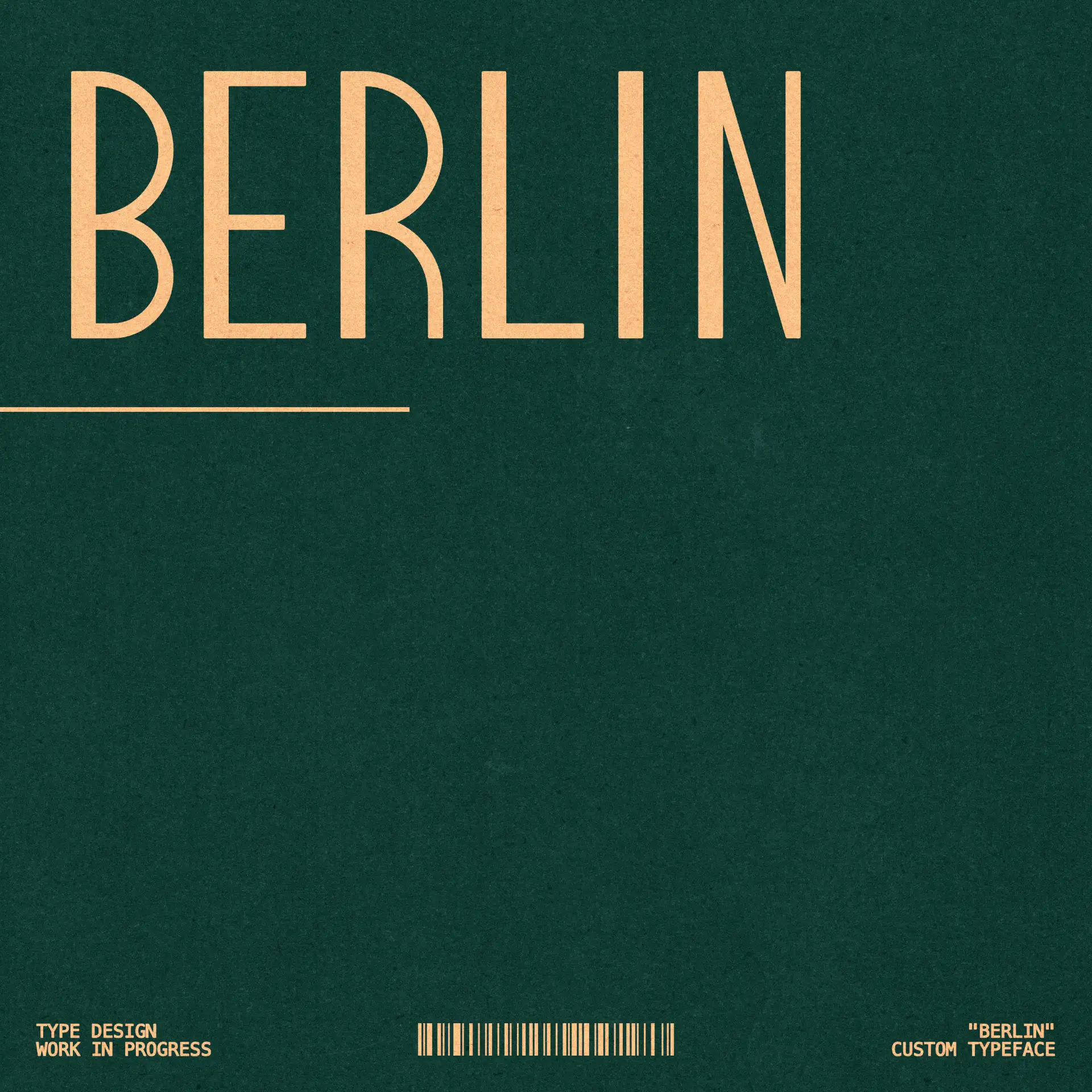
The starting point was proportion: how narrow a sans-serif can get before it stops being readable and starts being decorative. The forms are geometric but not mechanical — the B and R carry open, generously rounded bowls against otherwise strictly vertical stems, and the terminals are cut flat, without flare.
Currently drawn as a display weight in uppercase. Lowercase, numerals and additional weights are in progress.
Credits
Info
Berlin Condensed is an in-house typeface study, still in development.
The starting point was proportion: how narrow a sans-serif can get before it stops being readable and starts being decorative. The forms are geometric but not mechanical — the B and R carry open, generously rounded bowls against otherwise strictly vertical stems, and the terminals are cut flat, without flare.
Currently drawn as a display weight in uppercase. Lowercase, numerals and additional weights are in progress.